
Kirbites
This project scope is wide enough that we had to cover the design and photography aspects. This includes developing a branding identity while maintaining the client’s wants for the characteristics. The client also needed promotional materials. As the client did not have any professional pictures taken of the brand, photography work was also done, which was complemented by advertising design.
Project Overview
Kirbites is a dessert brand that started from home. When the client opened their business, they needed branding materials and promotional items. They already had in mind the brand name.
As the client provided their list of required deliverables, we realised some of the necessary materials were missing — professionally taken pictures, branding assets and identity. We decided to start from scratch — the brand identity and worked from there. We also did photography work for the client and post-edits. After all these were done, we then created advertising design work.
As the client had just started, we had to work while keeping the cost low and maximising efficiency. We then agreed to create digital promotional items.

Objectives
As the client had just started, the deliverables main purpose is to help the client launch their business into the market and create the necessary materials. Cost-efficiency method was preferred pathing this project to online advertising. Some of the deliverables for this project are:
Logo
Graphic Assets
Branding Identity
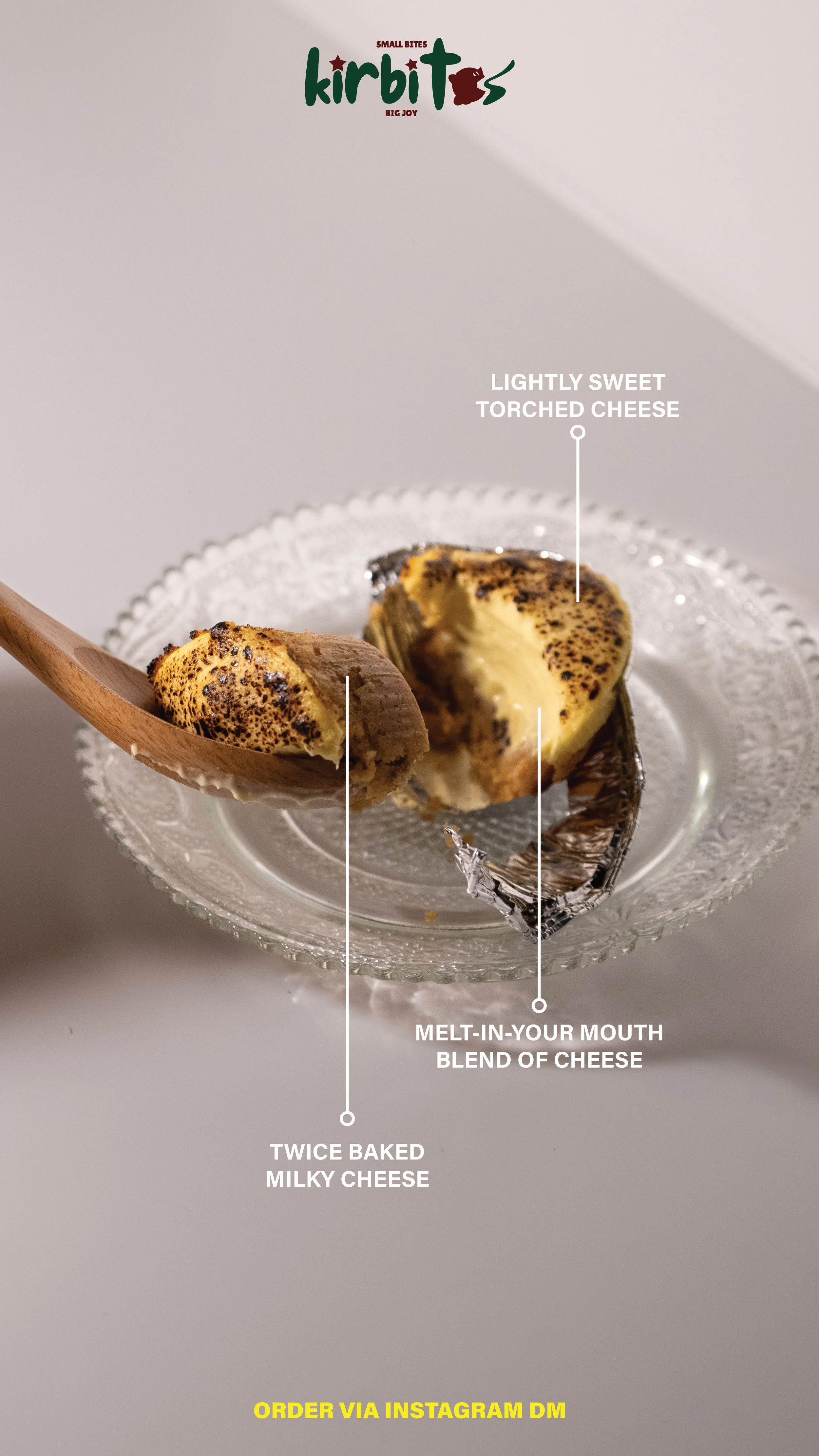
Promotional materials for online advertising — mainly through Instagram. We decided on 4 Instagram stories and 10 photos for the Instagram feed.
Retouched photographs
Digital menu
Through these deliverables, we expected Kirbites would be able to launch their business to the market smoothly.
Concept & Ideation

We started off with the brand’s name and with some preferences from the client about the brand identity. They wanted it to be fun and welcoming. From here, the logo was then developed, showcasing a playful style. A secondary mark was also created and applied with the main — its purpose is to be utilised when dealing with limited sizes and work as the brand identifier.
As the client was just starting off, we had no pictures for the brand and had to develop some. I offered the client with photography services, creating professionally retouched photos for the dessert and additional images for online marketing purposes. The photos were taken in a small studio setting with minimal equipments as the client prioritised tight deadlines.
After these images were taken, I developed the design work for Kirbites, combining graphic assets and photography materials. Most of the work involved creating promotional design for Instagram — minimal budgeting with highest efficiency were prioritised. Working closely with the client was essential as revisions were needed to adhere the client’s request and needs. Further graphic assets were also made to complement the brand design.
At the end, I developed a brand identity guidelines for the client. This was done as the client requested so they could also utilise the branding style whenever they need. Assets such as secondary colour palette, graphic assets, size requirements, and typography usage were all compiled for the client.


Reflections
I believe this project has been a wonderful experience — working closely with the client to help develop a dessert brand from the ground up. The advertising design work and photography work were combined, creating a holistic design whilst meeting all the client’s requests.
This project emphasised the importance of working and collaborating with the client at every step. Additionally, as I had to do both design and photography work, I had to work around a tight timeframe to ensure the client’s deadline was met. Careful planning from the start made this project a success, ensuring the client’s satisfaction.