
PWP Binus
Branding and promotional design work. This includes developing a design concept while addressing the client’s needs and preferences. Marketing collaterals were created, such as the main poster, design assets, brand logo, and online touchpoints, from Google form banners to Twibbons to Zoom backgrounds.
Project Overview
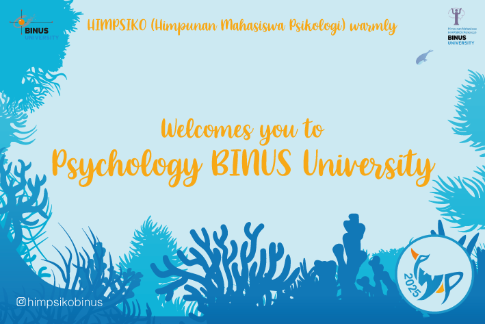
PWP (Psychology Welcoming Psytroopers) Binus is a program Binus University created to welcome their newly enrolled students in the psychology department. Binus required promotional materials to promote the program. They had clearly asked for a poster at the start. The client is based in Jakarta, Indonesia, hence the use of Bahasa Indonesia in the branding.
The target audience of this project is primarily the newly enrolled students in the psychology department of Binus University. The secondary audience is the staffs that helped the program as they will also interact with the program’s branding.

Objectives
As Binus only asked for a poster at the start and did not know what they would need, I had to talk with the client regarding their needs and if there is a specific preference or requirements regarding the promotional items. After this was finished, we decided the scope of the project was to create:
Logo
Poster
Banner
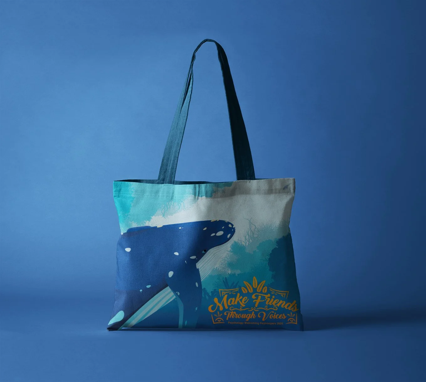
Merchandises (4 stickers, keychains, wristband, tote bag, greeting and introduction cards)
Twibbon
Google form header
Zoom virtual background
Through these deliverables, Binus would have the assets to use for their program. Ultimately, this project aims to have a successful program that welcomes new students and encourages their participation.
Concept & Ideation

After the talk with the client, Binus has outlined some of their preferences. They wanted a sea-themed branding with whale as the primary graphic asset. As I tried to address their preferences, I sketched out some initial ideas for the primary poster. I also experimented with the logo typeface. As it is a sea-themed, I incorporated fluid elements with the logo to depict the ocean look. I also illustrated the whale after the sketch, making it the primary graphic asset and can also be further used in the other branding assets. I also used mostly blue colours in the branding, complimenting it with an orange colour to highlight certain assets and harmonise with the blue.
I then created the other assets, such as the merchandising by utilising the primary asset and logo. This was done to give a cohesive look throughout the branding asset and the campaign. I also had to produce the promotional items with requirements the client had requested for as they would then be sent to their preferred printing services. The logo would then be created, incorporating the acronyms and the whale look. This logo was then given out to the client to be used for their other branding materials.


Reflections
The challenges I encountered in this project were finding out what the client’s needs were, incorporating the client’s preferences throughout the overall design, and the multiple revisions the client requested.
This project underscored the importance of debriefing with the clients, finding out what the clients want and need, and communicating effectively with them. Additionally, it provided valuable lessons for me to limit the amount of revision for future projects to ensure the client does not misuse the opportunity to revise.