St George Stadium
A revitalisation project involving an abandoned stadium. The site has an important history to the public, influencing the design decisions and outcomes of this project.
Project Overview
St George Stadium has been neglected for quite some time and the place required a reinvigoration as a public space. The stadium used to be very popular in the 1980s with national and international matches taking place, but it has not once been redeveloped since its opening. The stadium would be renovated as a sports facility to enhance engagement with the local community.
The target audience of this project is primarily the local communities and the people who live around the area. The secondary audience would then be the football clubs in New South Wales as we are reinvigorating the site as a football stadium.
Objectives
The scope of the project is to create:
Brand name
Logotype
Colour palette
Primary poster
Promotional poster series
Website
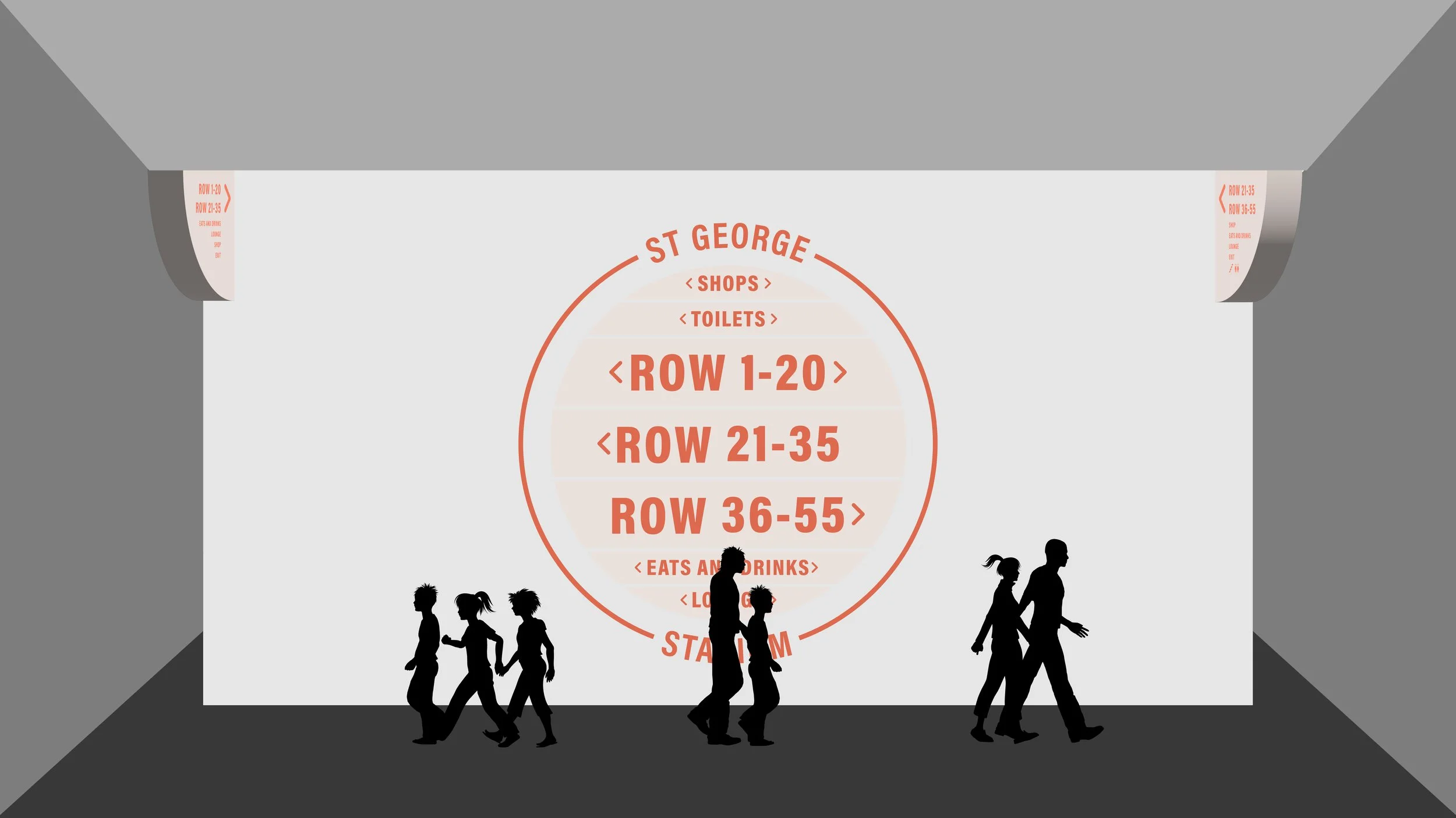
Signage or wayfinding
Through these deliverables, the site would be reinvigorated as a new sports facility for the local community. Ultimately, the goal of this project is to increase the engagement between the site and the public through the site redevelopment.
Concept & Ideation
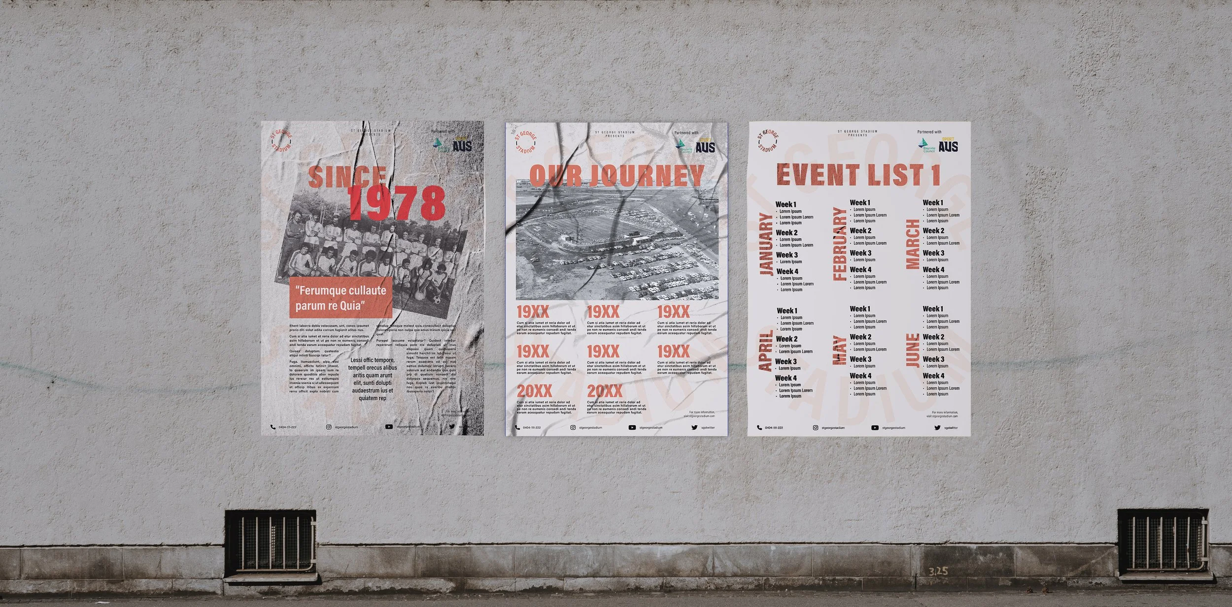
As St George Stadium has a long history behind it, I had to incorporate their golden era in their reinvigorated space. To do this, I first researched the brand’s past and recent uses. Through this, I decided to use a retro style to incorporate the brand’s history into the new identity. I manipulated the typeface with a circle outline, creating a round look. This was intended to represent the stadium’s golden era where it was used internationally as a football stadium. I also utilised a retro colour palette, incorporating the beige and orange combination. This was done to reference the stadium’s past promoting efforts in the 1980s where they mostly used the two colours.
Afterwards, I utilised the primary assets in the other touchpoints, creating a cohesive visual design. The logotype was applied to the primary poster flawlessly, creating the sense of a large stadium. This primary poster could also be utilised in different ways as it is flexible in the application. It could be added with other graphic texts or even photographs. A poster series for the stadium was also created for the new sports facility. The signage for the site was then created with the new brand identity, incorporating the circles, the two-colour combination and the retro typeface. Other touchpoints were also created like tote bags, tickets, and t-shirts.


Reflections
The challenge I encountered in this project was to apply the brand history values to the new identity. Additionally, the newly created retro visuals would also have to be cohesive throughout the design. It was also a challenge to the signage system and wayfinding, as well as incorporating the branding characteristics into the overall look.
This project underscored the research into brand historical values and applied them to the new reinvigorated brand identity. Through this project, I also learned to create a systematic wayfinding for a site which I have little opportunity of in other projects.